Though most of my Graphic Design work through Kerr Promotions is purely recreating existing designs to be used for imprint, on occasion a customer will request a design completely from scratch, allowing me the freedom to create something for them. The designs below are those that I have created for clients through my current employer.
Maruca's - Bar Tokens - I had the pleasure recently of creating imprint designs for bar tokens to be used at a local bar. These tokens would reward customers with whatever was listed on them. There are 4 color combinations, each with their own design and the black being the high or rare token.
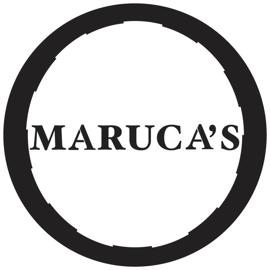
This was the general look of the front or side A of the token with the bar's name on it.
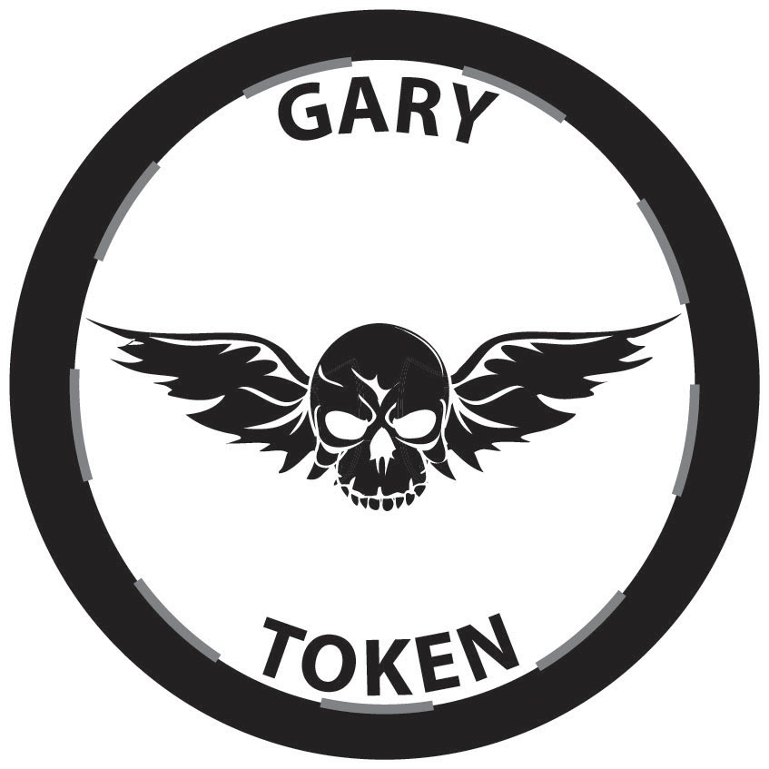
The black, grey & white token was the high or rare token with the owner's name on it. He had wanted a skull with wings, similar to those used in biking gear design.
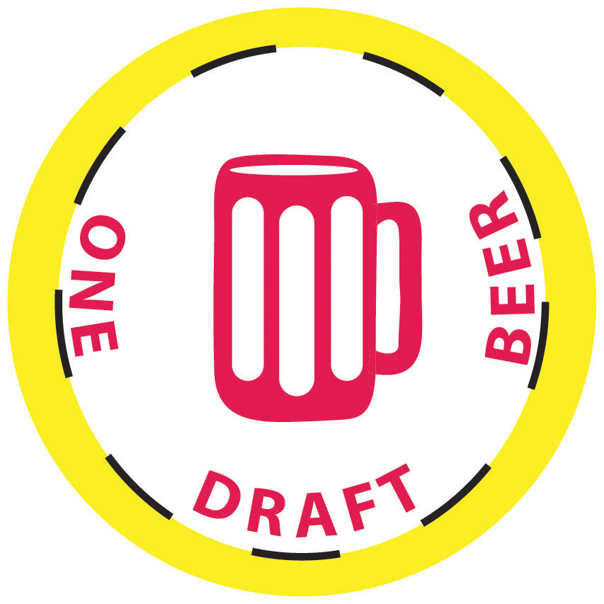
This yellow and red token, when turned in, would reward a customer one free draft beer. I wanted to keep the design simple so I drew a draft mug.
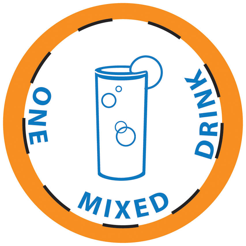
This orange and blue token, when turned in, would reward the customer with one free mixed drink. Since there is a wide variety of mixed drinks & glasses used for them, I went for a common look of something bubbly with a piece of fruit.
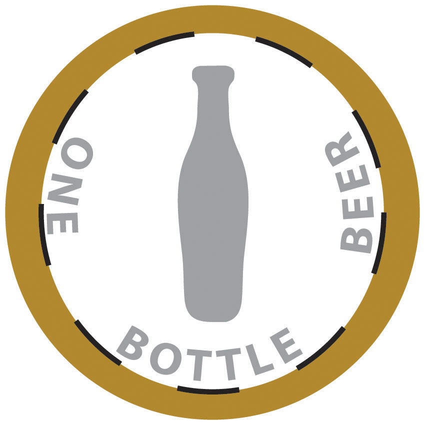
This tan & grey token, when turned in, rewards the customer with one free bottle of beer. Like the draft token, I went with a simple look and shape easily recognizable should the text ever wear off on the tokens.
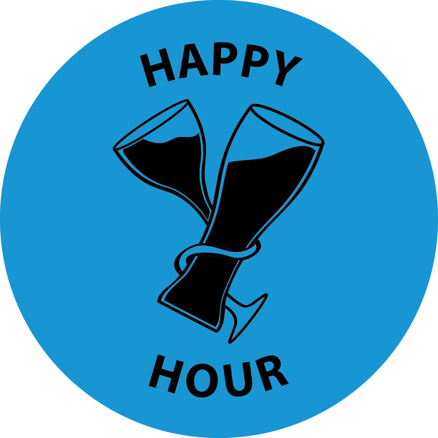
This blue and black token was created to be used for Happy Hour specials. Because alcoholic drinks during happy hour can be a mixture of anything, I kept with two standard glass designs and left them filled as I intertwined them to create a "tipped" or "lushed" effect while representing a joint celebration.
LCG - Liquidity Capital Group - Sanitizer Label Imprint
-This client requested a label imprint that incorporated their existing logo colors which was a gradient blue, grey, and white.

This is the final label. In using the colors requested, I created a softer level of blue from the gradient in their logo as the background and using a white overlay, accented bubbled streaks I had run through the background to give it a pattern design. I then accented the text with shadows all except the last line in order to make them stand out.
This is the background that I had created. It is a simple series of heavy charcoal strokes in white that were faded and overlayed with a white bubble to add as a light effect to bring the stronger areas with the streaks intersected out. I wanted the pattern or background to be subtle since similar text colors were going to be used but still apply the notion that this was going on a container with liquid inside. In this case, bottles of sanitizer.

Using the customer's already existing preference of grey, I added shadow to three lines of the text to ensure that they would stand out above the lighted background and give the overlaying white text the chance to be more legible.