Kerr Promotions
Graphic Design Work
Graphic Design Work
During the day, I work as a Print Composer for a publishing company & Graphic Designer for a sub division of my employer that does promotional work. We have a lot of local companies as clients & though most of the work is recreating existing designs, I do from time to time get the opportunity to create an imprint from scratch. These are what I have had the pleasure of doing so far.
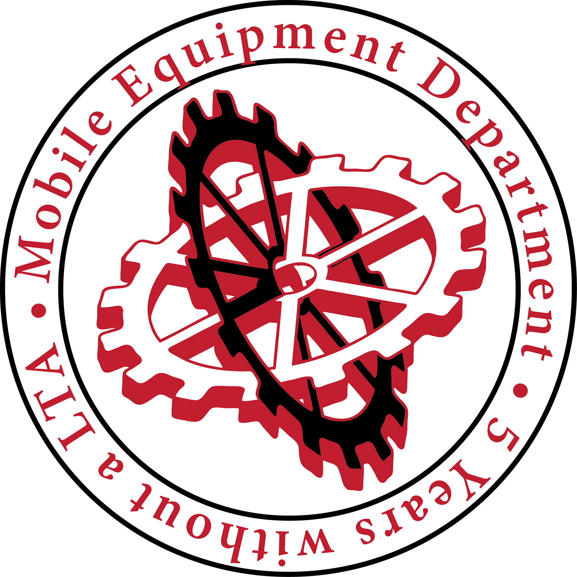
Appleton Inc. was looking to do some T-shirts for their Mobile Equipment depart to go along with a number of t-shirts being printed throughout their company celebrating no LTA's. In this instance, we went with a two color (white & red) circular full back imprint on a black t-shirt. The interlocking gears felt like a nice way to capture the mechanical work the Mobile Equipment department takes care of.
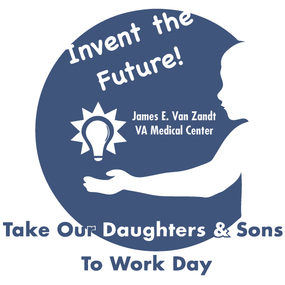
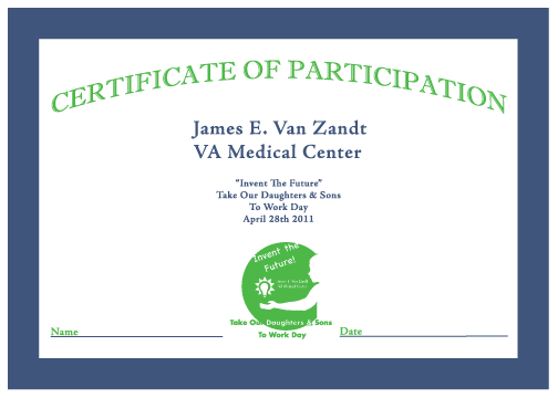
When "Take our daughters & sons to work day" came about at the Va Medical Center in Altoona, they decided to have T-shirts & Certificates created for the parents & kids who participated in their "Invent The Future". I stuck with a single navy imprint for the t-shirt & a 2 color green & navy imprint for the certificate. I wanted to give the design a genderless but powerful look so I chose a side profile of a child with an illuminated light bulb floating above their hand.
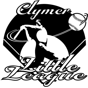
A local Little League division was looking to do t-shirts that were different from the average baseball t-imprint, something that would capture the kids imagination & speak about what makes the league what it is. I decided to go back to the era of Babe Ruth & recreate a "monumental hit" moment for the kids along with a clear script type in a single color imprint.
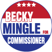
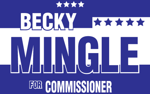
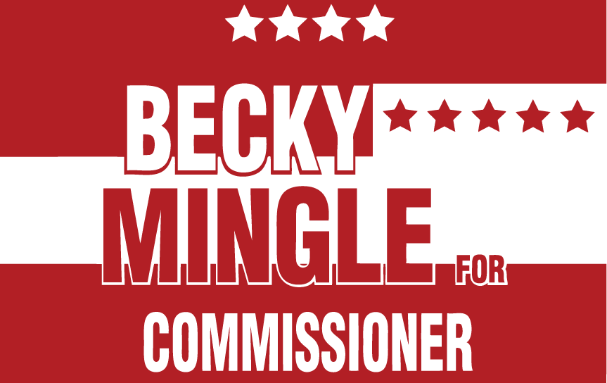
During the political run of local officials I got the opportunity to create a button & two yard signs for a woman running for commissioner. I went with the basic red white & blue coloring but setup the stars & stripes differently to be just as noticeable as the woman's name but not too political & overwhelming in the design.
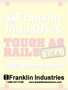
A local industry was looking to do some pads that were more than just their logo on white paper. So I incorporated steel elements in a ghost imprint for a yellow & red pad, something that signified exactly what the company was about but still left you able to see whatever it is you may end up writing on it.

One of the larger imprints I have done, this customer provided me with a photo & their logo and asked me to create a bus sign that would be easy & quick to read as it passed by, but was also colorful and memorable. I decided to make the photo primary next to the logo and added blue & white boxes so the photo faded out instead of consuming the entire background or ending abruptly.

My alma mater for my k-12 education was looking to redo their mascot for a book bag imprint for the graduating class of 2016 that would just be entering high school. A comet is such a simple creature but I decided to make mine a little more complex, hiding an aggressive face amongst the burning rock to give it an edgier look. I only wish that I had the opportunity to do this when I had been in school.
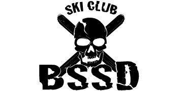
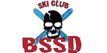
Another local school was looking to do a rad design for ski cap imprints for their ski club. Something that would encourage the kids to wear them & stay with the current clothing designs we see out there today. That's why I went with a skull & crossbones type of look except I replaced the crossbones with skis & gave the skull a crack. I also chose a jagged font to match the ragged lines of the design.
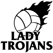

The same school from the previous imprint also came back looking for a more modern creative design for their volleyball team shirts. Something a little less basic & with more of an edge. I went with a more collegiate feel with this, edgy font but sharp clean logos styled together.
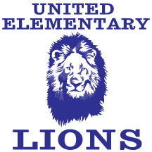
Another local school was looking to do mugs for their elementary school but needed a new look than a basic lion imprint. Since this was for k-6 kids, I went with a complex almost portrait style for the lion, something kids could easily recognize from their classes & used a basic but school styled font.

A local golfing company was looking to do a banner to place up for passing motorists to see that they were holding a youth program hosted by a professional PGA teacher. They wanted a two color imprint, something that would get the message across quickly but with an image that you would remember. I decided to go with a mix between a detailed & yet simple graphic imprint of a young child setting up to put. I made sure the dates stood out since they are often the information we tend to forget as we are driving by.

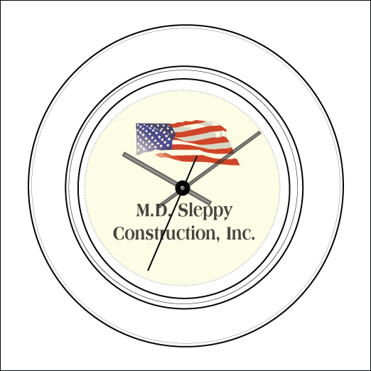
A local man who owned his own construction company wanted to create a clock for his son who was opening his own business. I created a flag & foreman imprint for him to choose from and he ended up liking both so much he got one of each. I wanted the images to be placed where you are likely to look first with the information of the company below that. I left the foreman as a simple design but I gave the flag a complex waving look as if it was being blown by the wind.
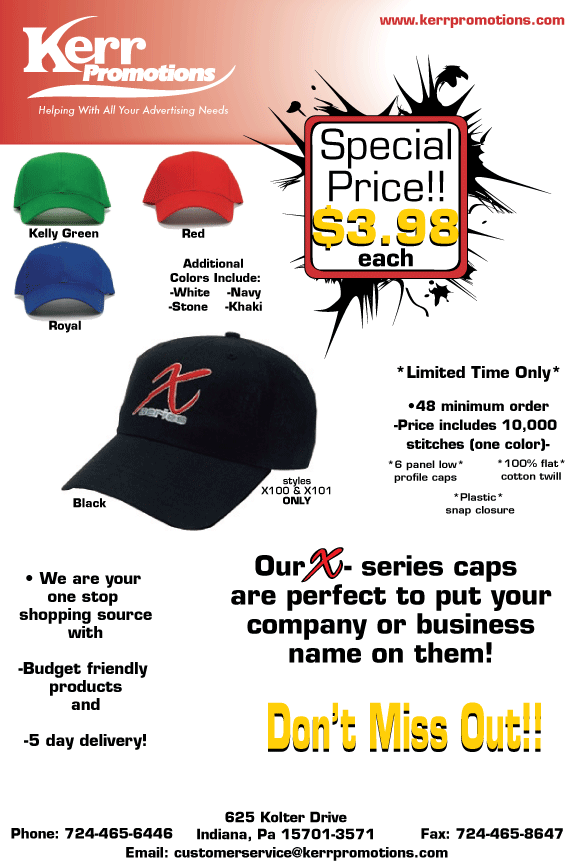
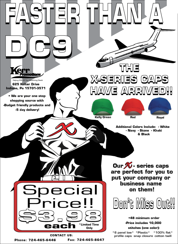
When I first came on as a designer, I got the opportunity to create two flyers for our company to use & put out for distribution to attract customers. I went with two different styles, one more edgier with a splattered ink effect behind the pricing & using a gradient color. The other I used a comic like approach that allowed the caps they were selling to be the most colorful element.