Here is a collection of my favorite Character Portraits that I've created this year. From comic to scifi and fantasy, each of these pieces have their own look and appeal, while all were created in Adobe Illustrator.
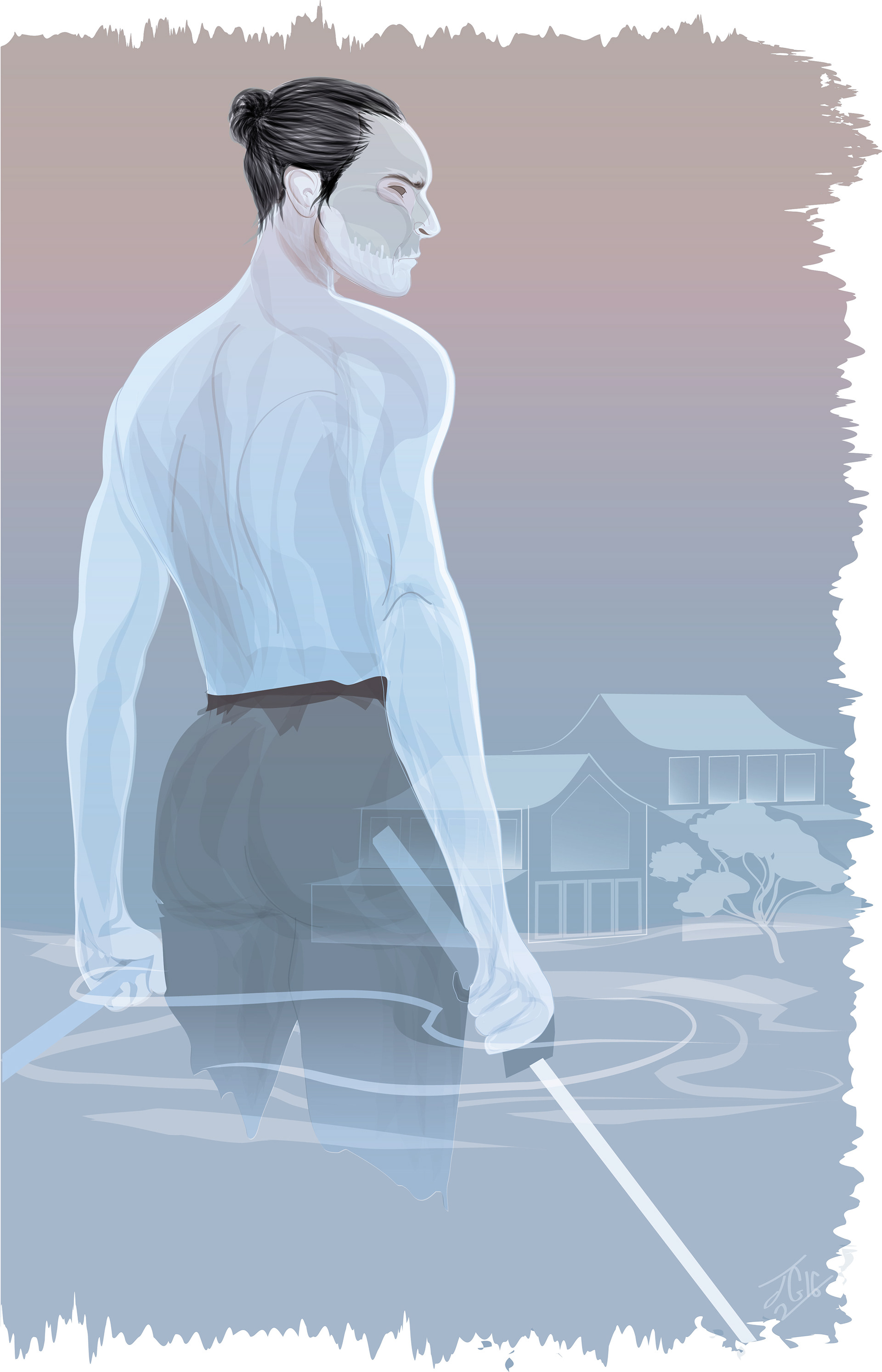
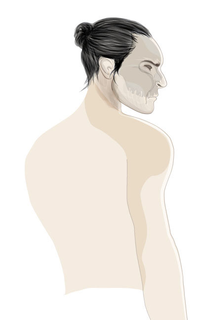
Ghostly Samurai
Sometimes random ideas make the best illustrations. I mistook an image of someone walking on water as a Samurai and felt compelled to do my own Ghostly work. I decided to try some new brushes out, in a sense giving myself a new style to play with, and worked with some different transparencies to get the overall finished look.
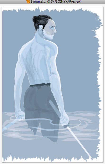
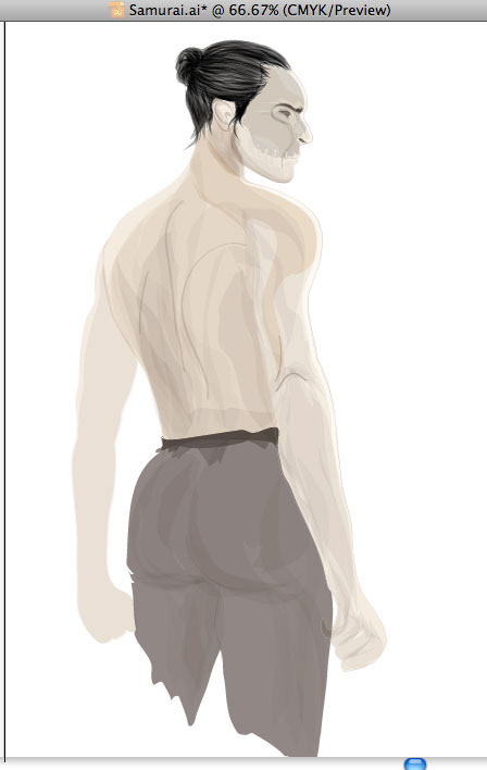
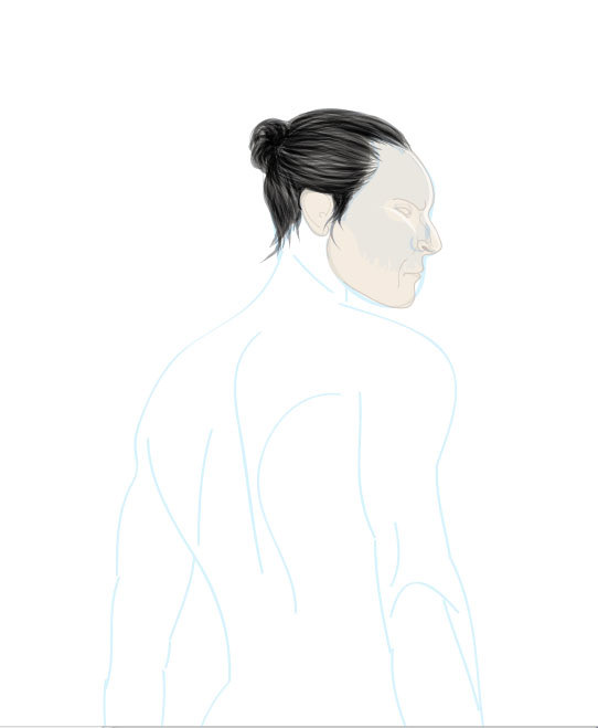
Below are pics of my progress--the base colors I first used and some of the original sketch I ended up detouring from.
Stone Archer
This is a unique piece. It comes off a bit surreal, as well as graphic design and pop art all in its styling. I wasn't really sure what I inteded to create when I first started this, all I knew is that I wanted to draw a stone archer in illustrator and I took it from there. Personally, I think it would go perfect on a wine label or package of somekind.
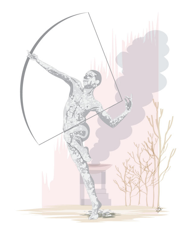
Here is the finished piece.
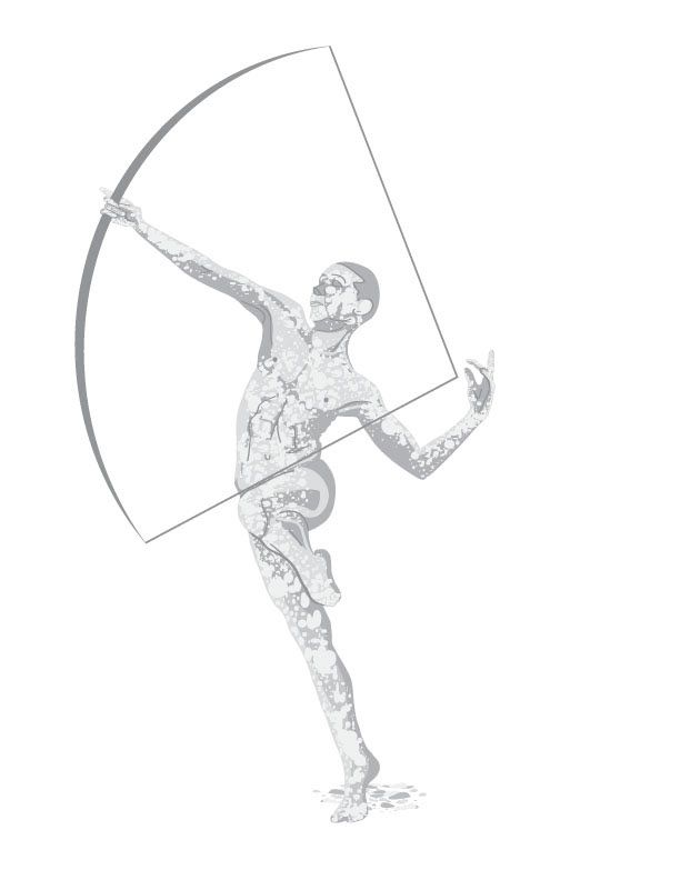
The archer standing on his own.
And here is the background by itself.
The Flash
I have always been a comic book geek, my collection of signed and rare comics can attest to that. One of my favorite shows based off of a comic character that I am enjoying at the moment is The Flash. So, when the urge hit me to do a poster, I had to listen. Below is what I came up with.
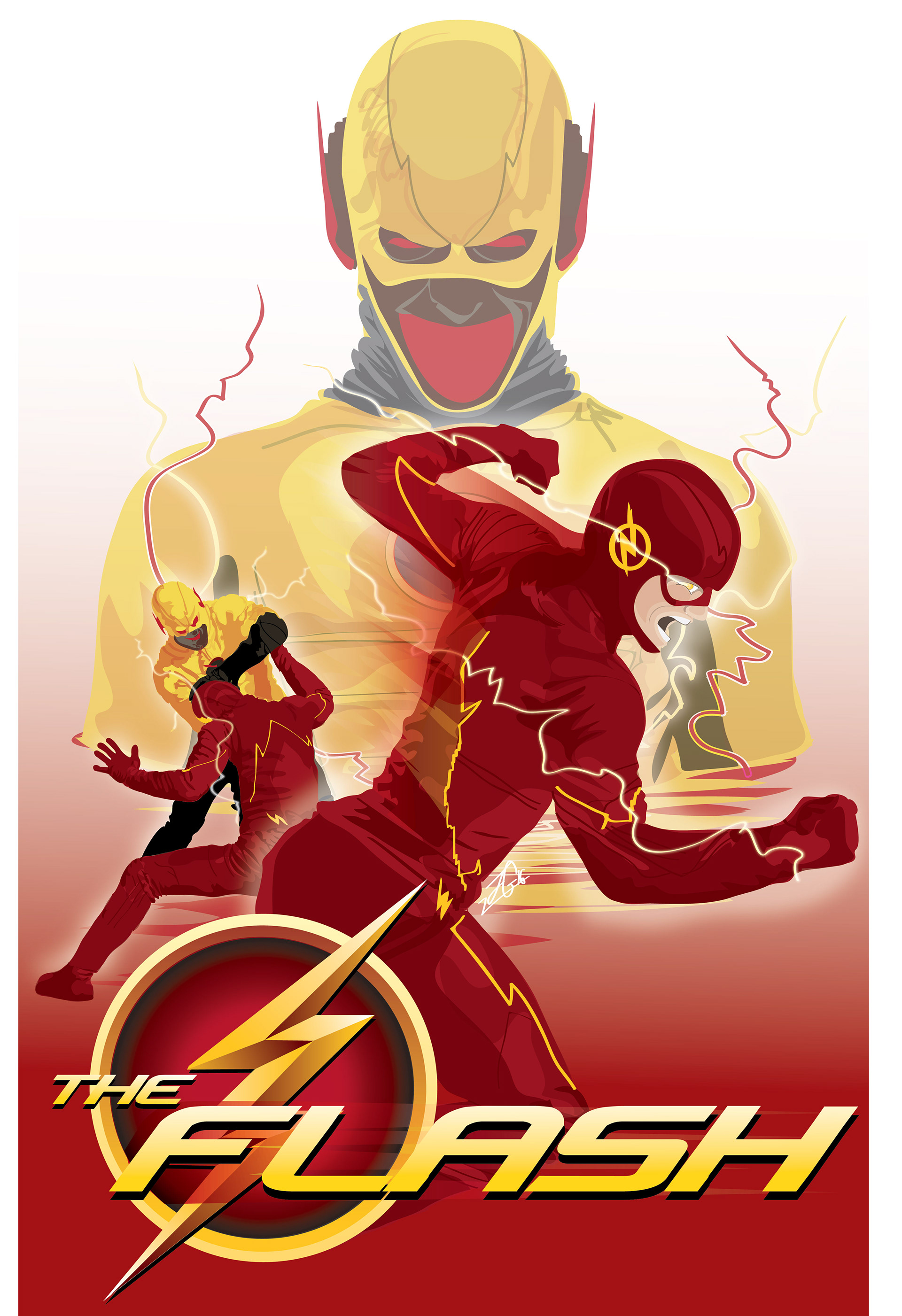
This is the finished poster. I learned a lot in creating this, not only with tools and techniques in adobe illustrator, but in framing the flash and reverse flash appropriately.

I wanted to capture the power struggle between these two characters without it overshadowing the whole piece. A lot of the shadowing and highlights is just overlays of the same colors at different transparency levels.
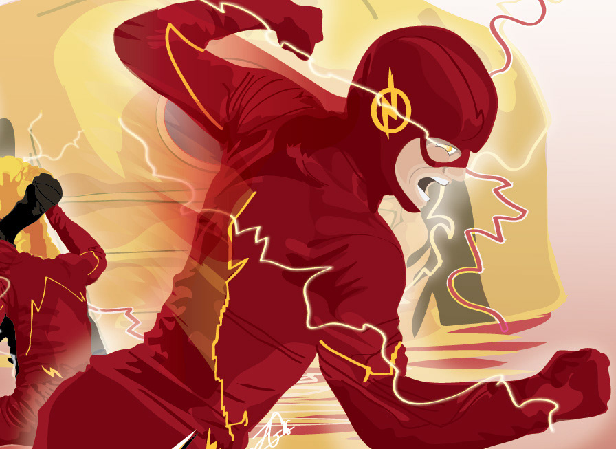
One of my favorite tricks in doing this piece is suggesting that the flash is speeding by. It was a simple set of streaks set with gradients and hard light layer effects.
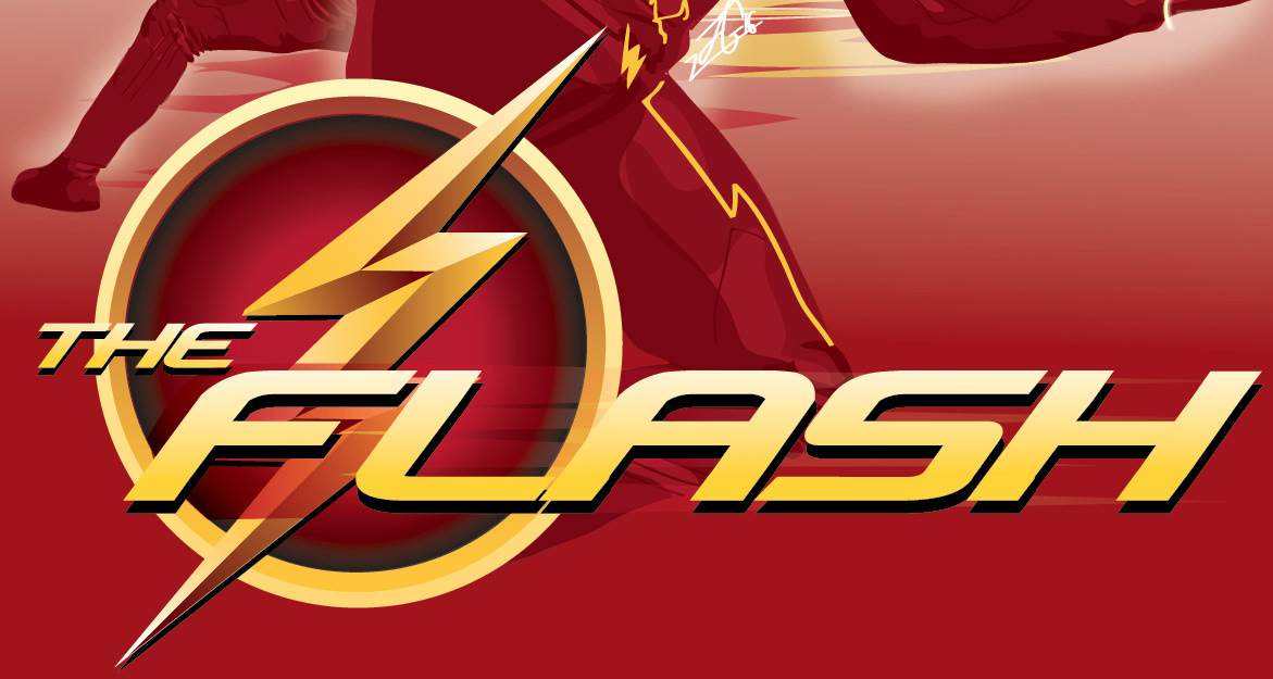
I absolutely loved creating this logo. The symbol itself was pretty easy, just gradients of red and yellow and white pointing different directions. The tricky part was laying the text over the symbol and making it stand apart since the colors are similar. Like I did with the flash above, I ran color streaks underneath on a hard light to help make it pop.
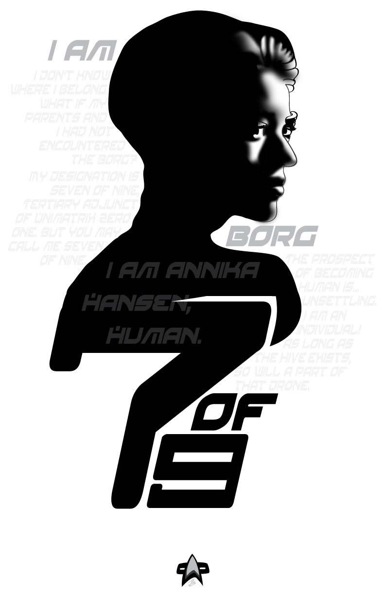
Seven of Nine
It isn't often I do artwork of an existing character. But I had done an old portrait illustration of Seven of Nine from Star Trek Voyager awhile back, and after coming across it again, I decided to put it to good use by making a poster out of it. I personally dig the black and grey tones, making this feel almost like a Bond film poster than a new age scifi one.